
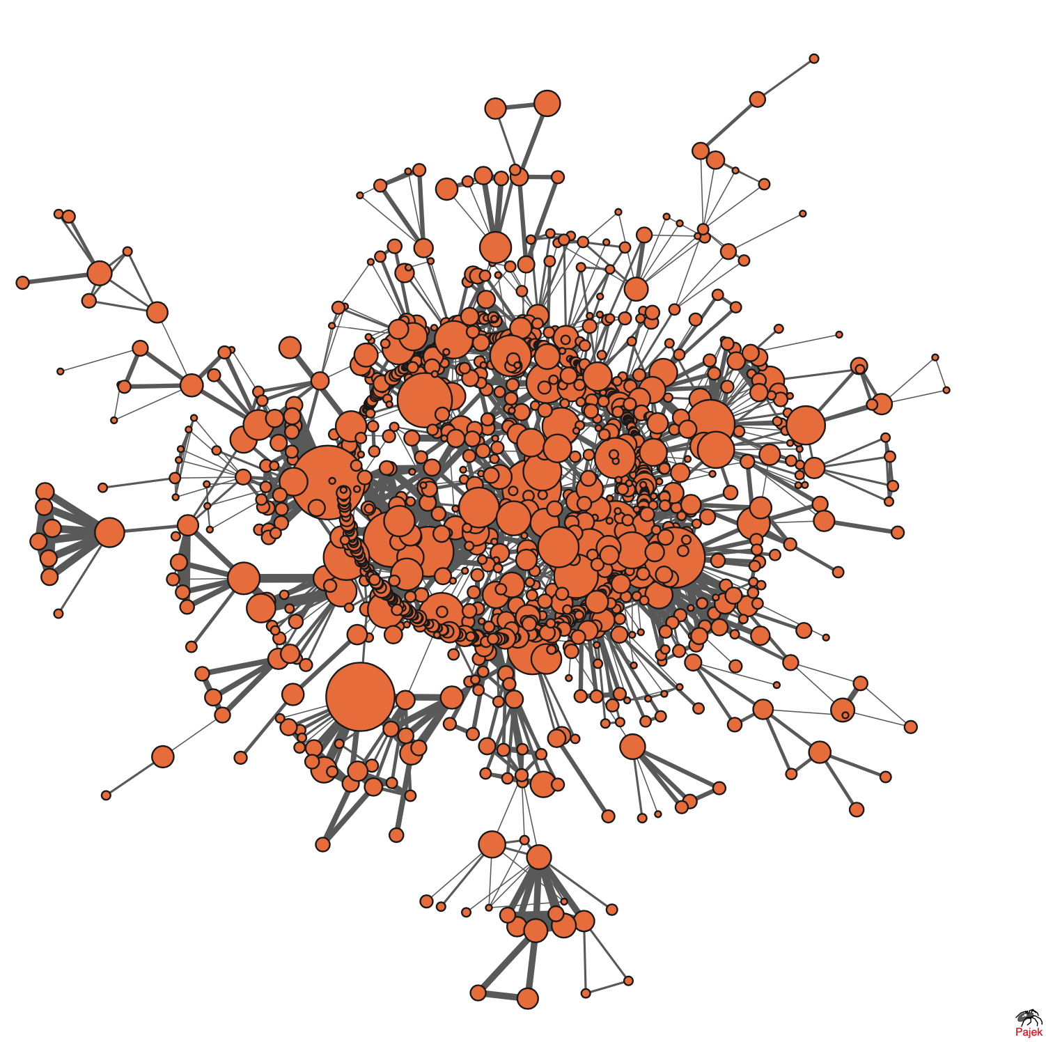
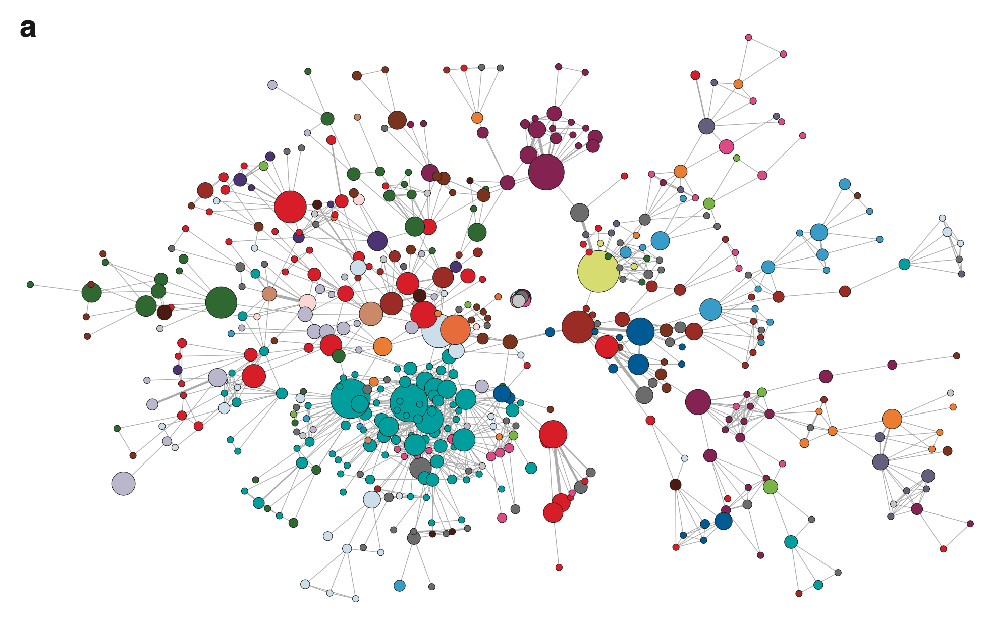
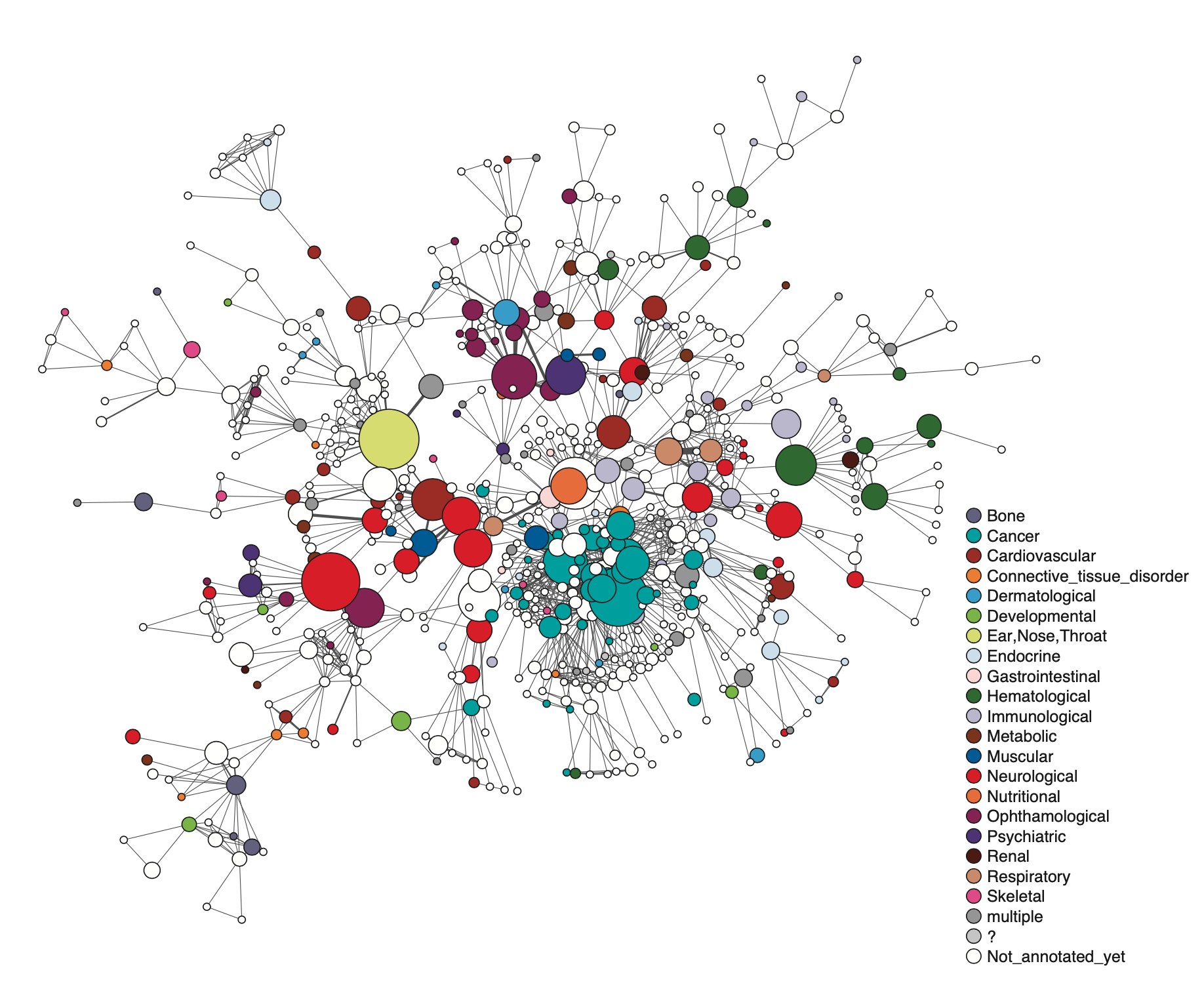
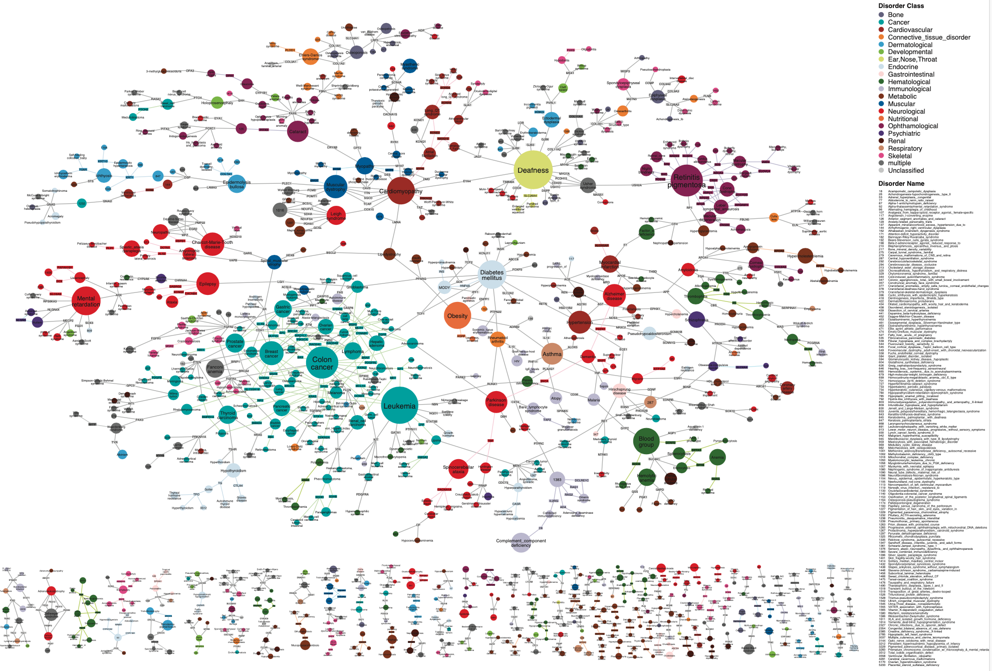
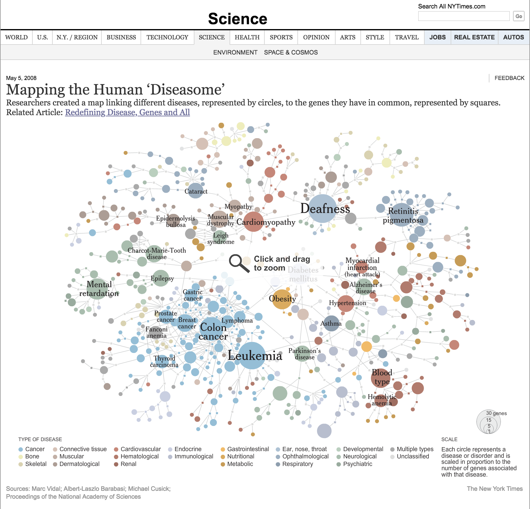
The project took form after the publication of the Human Genome Project in 2001, when it seemed like another gene was linked to another disease on a weekly basis. While on sabbatical at Harvard Medical School’s Dana Farber Cancer Institute during the 2005-06 academic year, Barabási found himself wondering what these many independent discoveries said about the relationships between diseases. The answer, he discovered, was a network in which two human diseases are connected through the genes implicated in both diseases. It took six months and many drafts to arrive at the Human Disease Network, which shows each node as a different disease. The size of the node reflects the number of genes responsible for the disease. Node color denotes the class to which each disease belongs. Cancers, for example, are blue nodes, as distinct from neurological diseases in red. The links correspond to the genes that connect the two diseases. The extreme node-size variation represents a significant departure from previous visualizations. By enhancing the visibility of the largest hubs, the range of hub-size allows the most explored diseases to dominate the visual space.
2007
Diseasome
About the work
The Human Disease Network is one of the BarabásiLab’s most reproduced images. Originally printed by the National Academies of Sciences as a poster to accompany the publication of a research paper on how diseases connect, it was subsequently reproduced by The New York Times and included in the Mapping it Out: Atlas of Contemporary Cartographies show at the Serpentine Gallery in London.
Team
The Human Disease Network, by A.-L. Barabási, B. Childs, M.E. Cusick, K.-I. Goh, D. Valle, and M. Vidal, created for “The Human Disease Network,” Proceedings of the National Academy of Sciences (May 22, 2007)


Contact
Social