2018
Art Network

About the work

In 2016, Barabási began turning the tools of network and data science, which his lab had been honing for two decades already, on the art world. He started with a massive number of data points about the exhibition history of half a million artists in galleries and museums worldwide that had been collected by Magnus Resch, an economist and entrepreneur who studies the art market. The data enabled the BarabásiLab to unveil the invisible connections that shape artists’ careers. 


Team

The Art Network, by A.-L. Barabási, S.P. Fraiberger, A. Grishchenko, M. Nauro, M. Resch, C. Riedl, and R. Sinatra, created for “Quantifying Reputation and Success in Art,” Science (November 16, 2018)

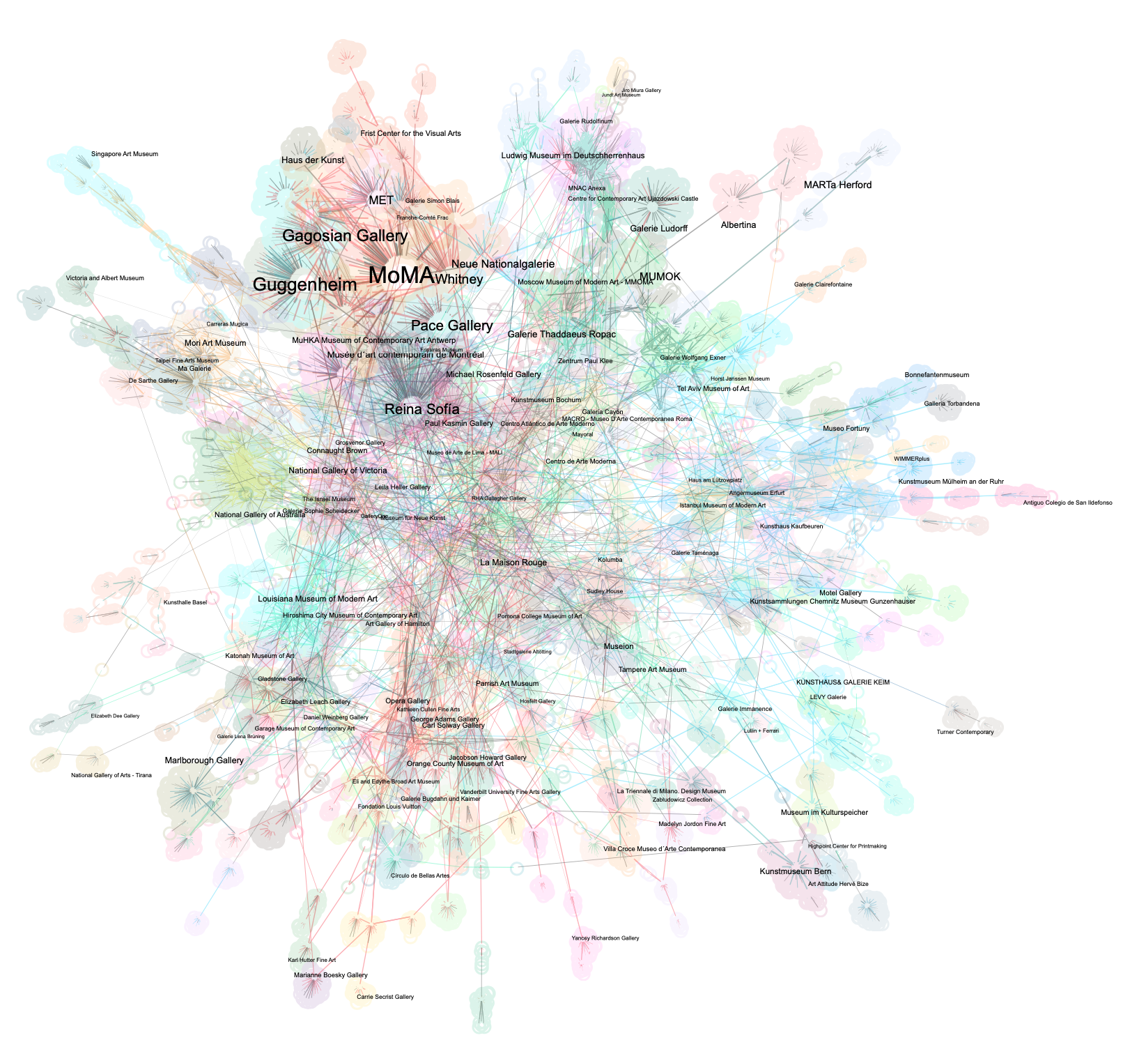
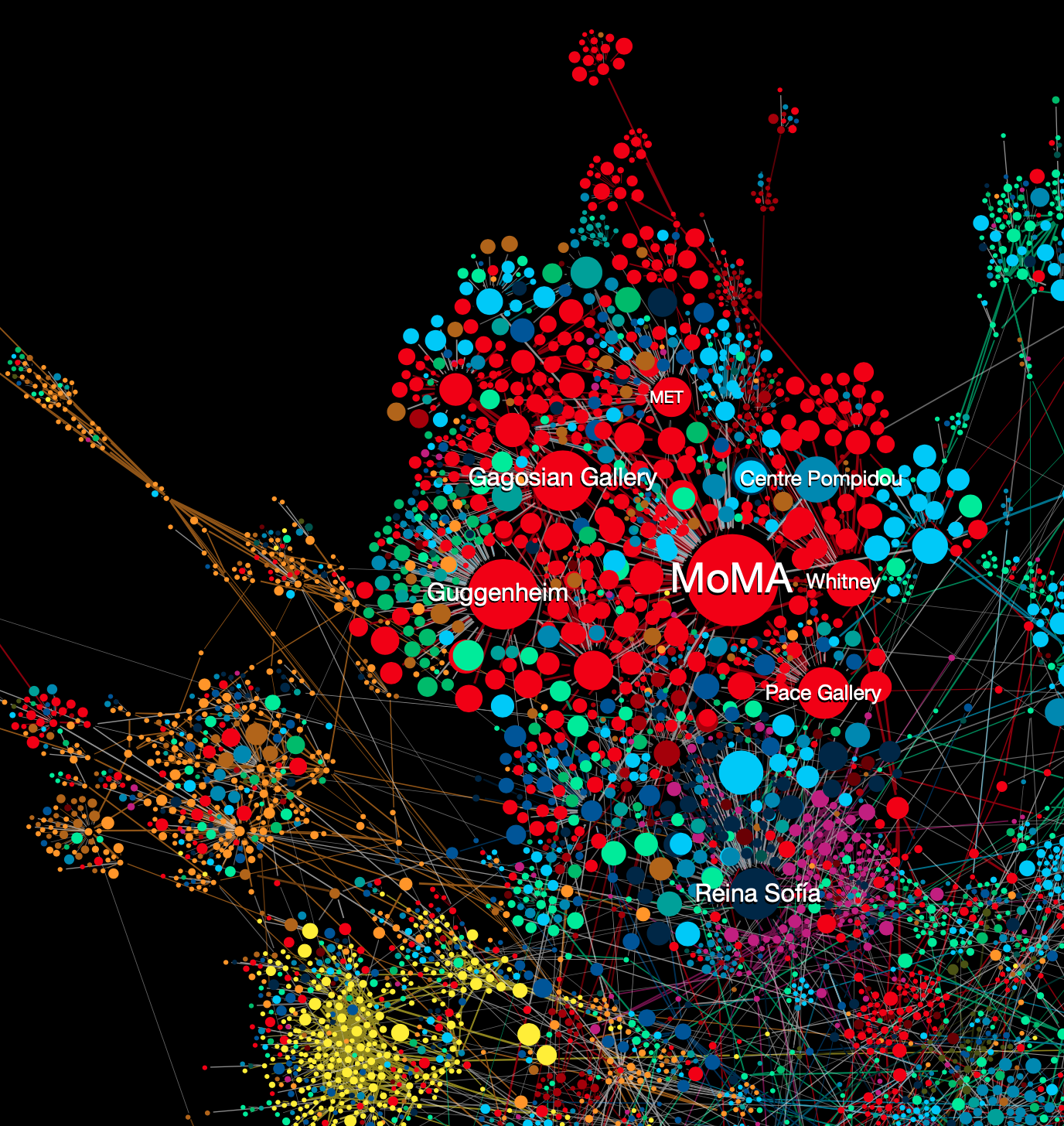
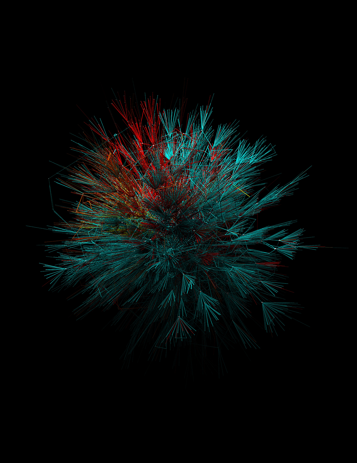
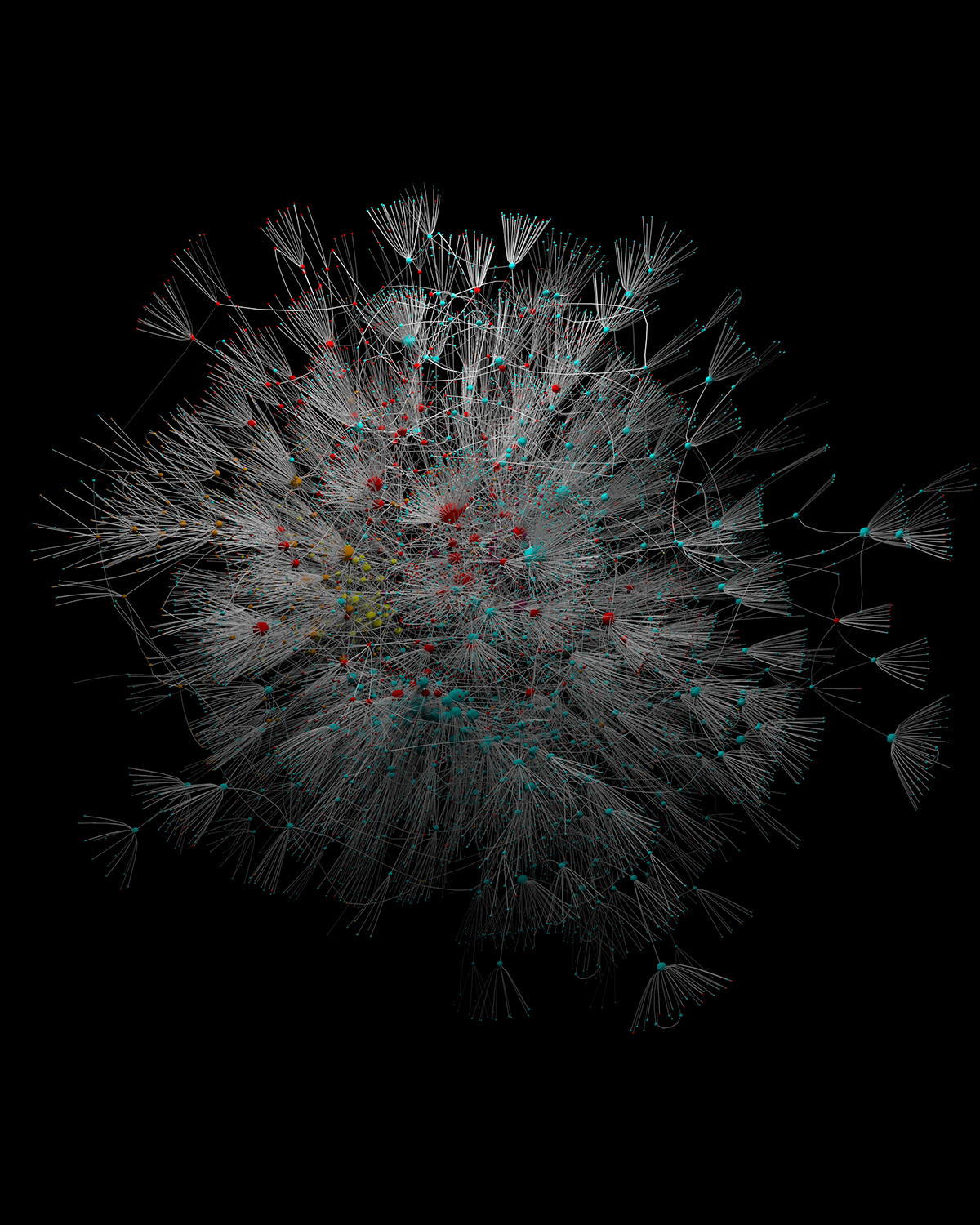
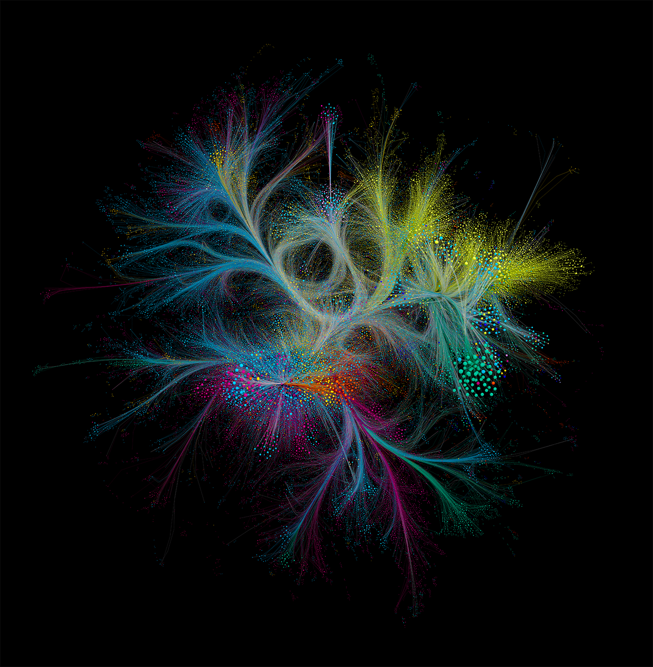
In The Art Network, two institutions—for example, a museum and a gallery—are connected if an artist whose work was exhibited at the museum is also exhibited next at the gallery, or vice versa. The image captures the largely invisible network of influence and trust between thousands of institutions worldwide.

At its core is a dense community of major European and North American institutions with uninhibited access to a common pool of artistic talent. These institutions are represented as large nodes. And it will come as no surprise to anyone who follows the art world that the largest among them are New York’s Museum of Modern Art (MoMA), the Centre Pompidou in Paris, the Tate in London, and the  Gagosian gallery. The colors, which indicate the countries where each institution is based, telegraph how the dense regional communities of institutions in Eastern Europe (green) or Australia and Oceania (yellow), for example, are largely isolated from the American (red) and European (blue) hubs at the heart of the art world. The network demonstrates how institutional prestige and hidden connections of influence determine access to opportunities for artists. 

The Art Network
The Art Network, zoomed in on the central cluster, with labels.
This 3-D rendering of The Art Network, with continents distinguished by color, was among the first of the lab’s ongoing attempts to represent this constellation as a data sculpture. 
This 3-D rendering of The Art Network, with continents distinguished by color, was among the first of the lab’s ongoing attempts to represent this constellation as a data sculpture. Alternate Layout generated by Mauro Martino and Nima Dehmamy.
This version of The Art Network reveals the identity of key museums and galleries and the connections between them.

Tags